Comics Review: "Conan and the People of the Black Circle"
I think I like the idea of Conan more than I like most of the stuff the character appears in. I like the Schwarzenegger movies, I liked some of the Marvel stories with the character, but whenever I tried getting into the newer Conan comics, it just didn’t work for me (even though I’m a fan of Brian Wood). That said, I recently picked up the 4-part mini series “Conan and the People of the Black Circle”, by Fred Van Lente and Ariel Olivetti.
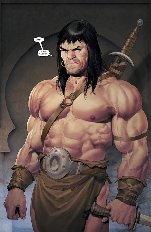
I wasn’t a huge fan of Olivetti when he was drawing the Punisher or Cable, but holy hell is his style perfect for a Conan comic. It’s beautiful. His Conan is fantastic. Everything about him screams “CONAN!”, just check out the picture above. It’s not just Conan, though. One thing that I often found missing in other “Conan” comics was the atmosphere that the movies created (the movies were my first exposure to Conan). “The People of the Black Circle” are as close as possible to what we saw in the Arnie flicks. The land, the people that inhabit it, the exotic cultures, the magic... hell, there’s even a few snakes in this thing. And it’s Olivetti’s art that brings this whole atmosphere to life. Even the various scenes of using magic kind of bring to mind the 1980s special effects (but in a very good way). You will know what I mean when you see them. This comic captures the classic Conan style absolutely perfectly. 
A sorcerer, working his magic.
The comic is also properly brutal and barbaric. Conan is killing people like it’s going out of style, slapping princesses asses and being Conan. There’s a scene where Conan breaks a guy’s arm with a door, and there’s several awesome sequences of our hero fighting fierce, magical animals and creatures. Like I mentioned, Van Lente’s script gives plenty of opportunities for Conan to straight murder things. 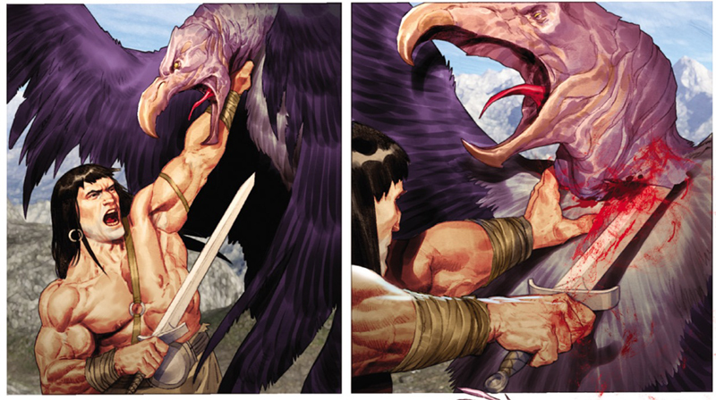
My only gripe with this comic is the lettering (by Richard Starkings & Comicfraft). Not the word balloons, but the narrative captions. For some reason, all the narration is done in a font reminiscent of an oldschool typewriter. I don’t know what’s up with that, but to me it seems really out of place, often bringing me out of the story. Typewriters and barbarians are just not a logical mix, in my opinion. It seems out of place, like a Star Wars font would be in a Sherlock Holmes story. Was it done as a reference to Robert E. Howard’s original works? Like he’s narrating it? I don’t know, but even if it’s meant to be a meta thing like that, it just doesn’t work for me. 
The "typewriter" style font of the captions.
This small complaint aside, this is a really good mini. If you’re like me, a casual Conan fan, you might really enjoy this. I wish Olivetti would do more Conan work for Dark Horse, so let’s hope this mini sells well. Buy it. What do you think about this latest Conan mini? Share your thoughts below! 
|
|

|
Social Trash Mutant |

|
Friendly & associated sites
|
© 2012-2020 TRASH MUTANT. All rights reserved. Some materials used are © their respective copyright owners.
